Enhancing design consistency for CareerRipple
Responsibilities: Lead UX Designer
Project Duration: October 2023 - Ongoing
What is CareerRipple
CareerRipple addresses the need for attainable opportunities for early-career UX professionals to gain meaningful real-world experience, enhancing their competitiveness in the job market. Recognizing the challenges of starting a career without sufficient guidance, CareerRipple aims to eliminate barriers by offering project opportunities that allow professionals to build portfolios, collaborate, and receive mentorship from industry experts. By facilitating independent group projects open to all, CareerRipple ensures users can access valuable career experience, fostering skill development and advancing their careers in a supportive environment.
Why I thought there was a need for a Design System
When I first joined the team as a UX Designer, I noticed inconsistency in various design elements that made it difficult to scale the design seamlessly, resulting in a fragmented and disjointed appearance. I found it challenging to onboard onto the team as there was a need to understand and adapt to inconsistent design practices. Such inconsistencies can also confuse users, impacting the overall usability and user experience negatively. To address these issues, I took upon the task to implement a design system.
How I got underway
After gaining a solid understanding of the problems I wanted to address, I established specific goals to encapsulate my desired outcomes and design principles, providing a clear framework to guide me in achieving those objectives.
Goals
Achieve visual and functional consistency across all elements to provide a seamless and cohesive user experience. Use a simple and clear naming convention
Streamline the design and development process by creating reusable components, reducing redundancy, and saving time and resources.
Resulting design systems should seamlessly scale to support the growth of a project or product, ensuring easy expansion without sacrificing consistency and be flexible enough to adapt to various contexts and user needs.
Provide comprehensive and clear documentation to guide designers, developers, and other stakeholders in effectively using and contributing to the design system. New designers onboarding onto the team should not feel lost!
Ensure that the design system aligns with the brand guidelines, reinforcing brand identity across all touch points. It is important to not lose track of the brand identity and be able to acknowledge and incorporate existing elements while trying to build a new design system.
Design Principles
Before getting started with the design system, I came up with 3 key design principles to guide the approach and decision-making processes toward achieving my goals.
Consistency
Maintain uniformity in design elements, interactions, and terminology across the user interface to provide a predictable and cohesive experience.

Simplicity
Keep the design simple and intuitive, minimizing unnecessary complexity to enhance user understanding and interaction.

Accessibility
Design interfaces that are inclusive and accessible to users with diverse abilities, ensuring everyone can use the product regardless of disabilities.
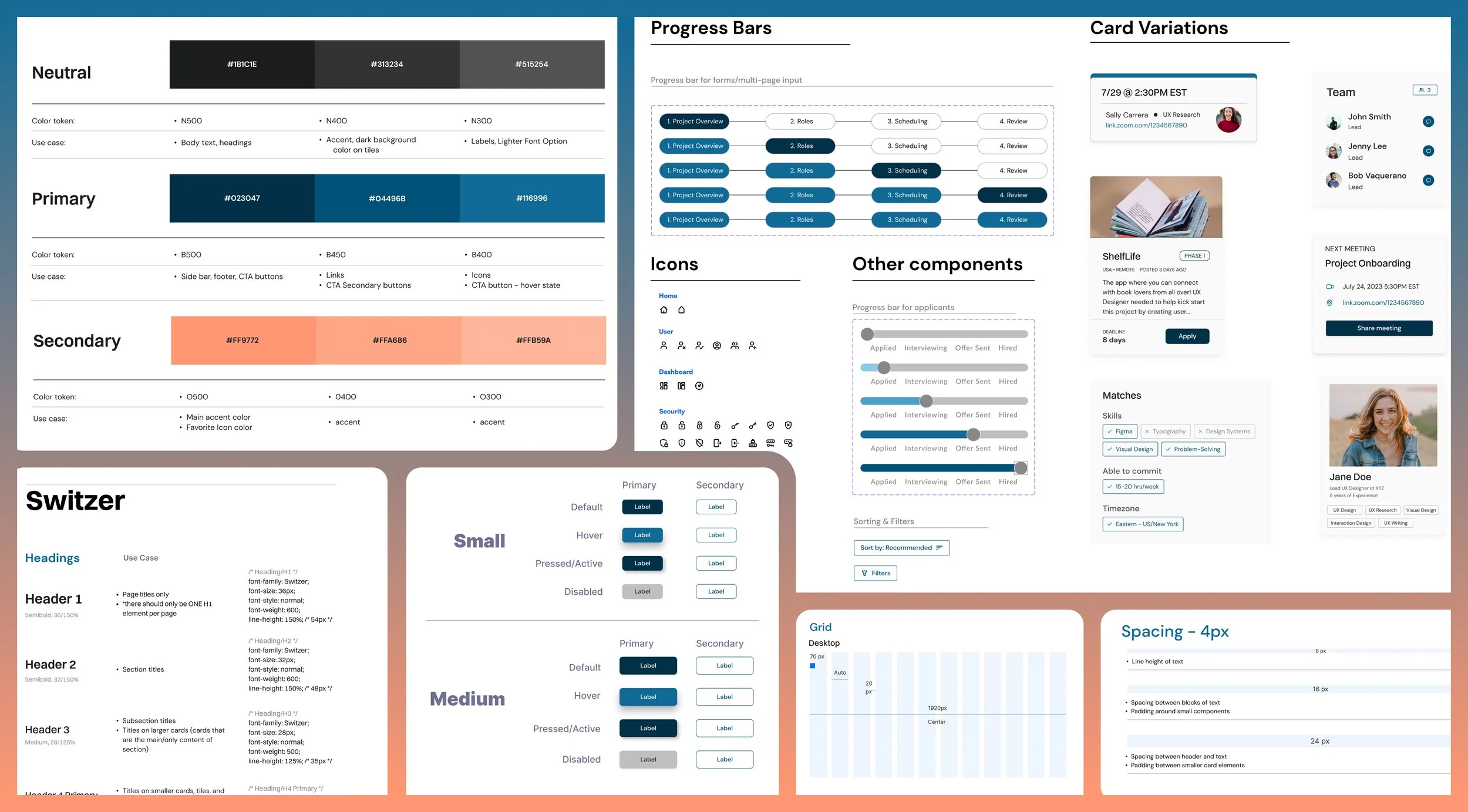
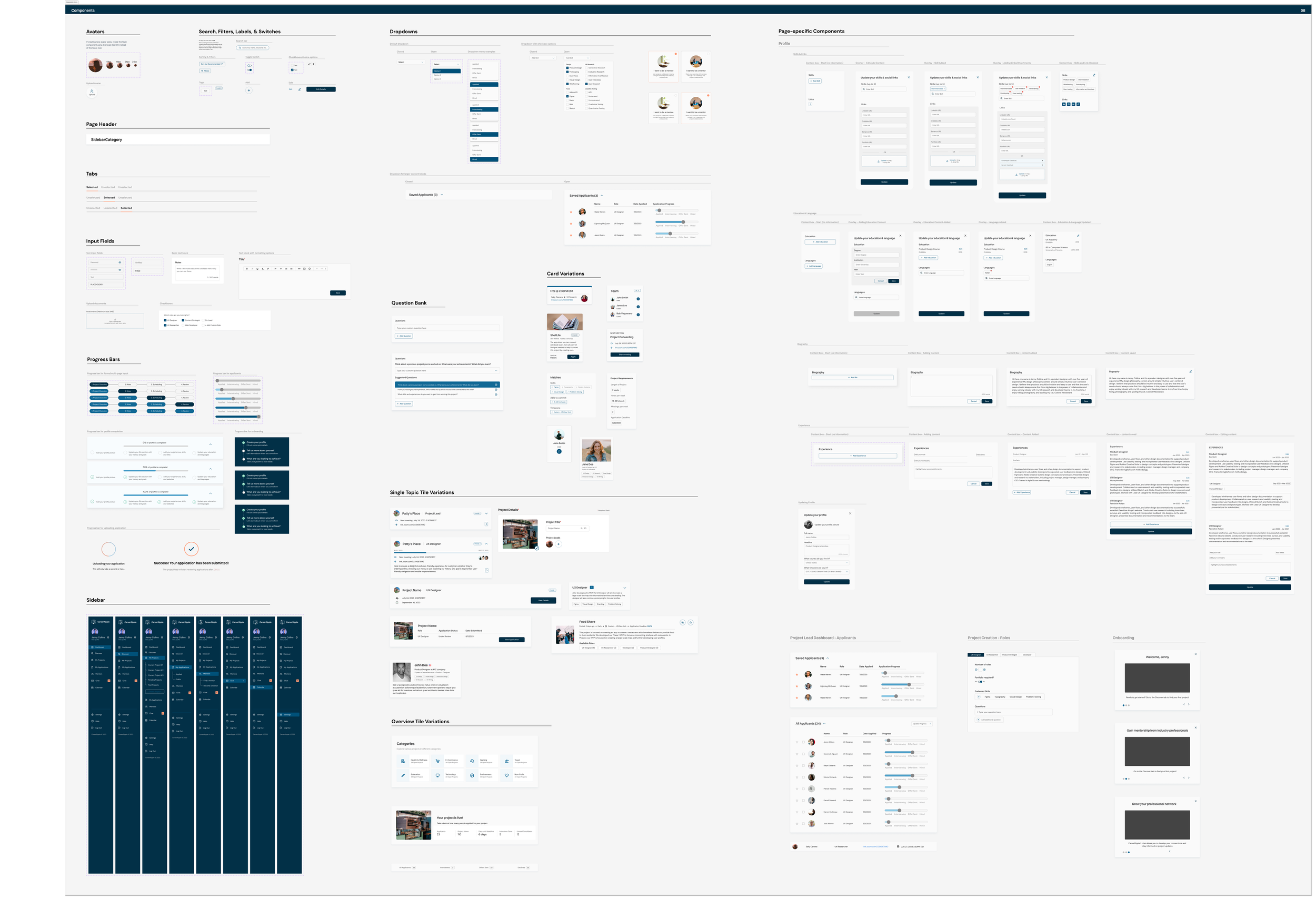
Spacing and Grid System
Much like a seasoned architect who meticulously plans and arranges building blocks to construct a well-designed structure, I believe a design system's foundation is anchored in its spacing and grid.
Typography
While the font family had been finalized, challenges arose as individual designers independently made decisions about styles, sizes, and line spacing. This variation in parameters resulted in inconsistencies for other designers and developers on the project, impacting the overall user experience of the website.
To address this, I opted for two font families: Switzer for headings and DM SANS for body text and buttons. This decision aligned with the client's requirement for a modern and clean aesthetic. Clearly defining specific use cases helped prevent confusion in font selection and ensured design consistency. Additionally, we supplied sample CSS for each font variation, providing developers with a helpful reference for implementation.
Buttons
Creating a button might seem easy, but it gets a bit tricky when you have to work with 256 variants of a button. Managing 256 button variants poses a significant challenge for the entire team, introducing a layer of complexity that can easily become tedious and error-prone. The sheer volume of variants increases the likelihood of oversight, leading to inconsistencies in design and functionality. This complexity not only consumes valuable time but also heightens the risk of user experience errors, emphasizing the need for streamlined design systems and tools to enhance efficiency and maintain a cohesive interface.
By utilizing Variant properties and values, the number of button variants was successfully reduced from a daunting 256 to a more manageable 64. This not only streamlined the component library but also enhanced accessibility for designers and developers. Selection of a variant was reduced to the selection of a handful of properties. This reduction in complexity not only made it easier for everyone to locate specific variants but also minimized the guesswork in design, bringing components closer to front-end code and ensuring a more efficient and cohesive design process.
Color Palette
Despite the careful curation of existing colors to comply with WCAG 2.1 contrast guidelines, the lack of documentation on their usage resulted in significant problems. Without clear guidelines, designers and developers lacked a standardized approach, leading to a proliferation of variations in the application of a single color. This lack of consistency not only hampered the visual cohesion of the interface but also posed accessibility challenges, as adherence to contrast guidelines was crucial for users with diverse needs.
I crafted the color palette to adhere to the WCAG AA standards, and organized them into distinct categories such as Link, Text, Background, Border, and Icons leveraging Figma color variables. The palette is extensive, reflecting the diverse range of badges requiring assignment, each with its unique color. While the variety is essential, I identified key colors within this palette that can be consistently utilized by volunteers during design and development tasks. Additionally, I introduced a streamlined approach to ensure better usability and consistency by creating a comprehensive guide outlining the specific use cases for each color category, providing a reference for volunteers to maintain a cohesive and accessible design language.
Other components
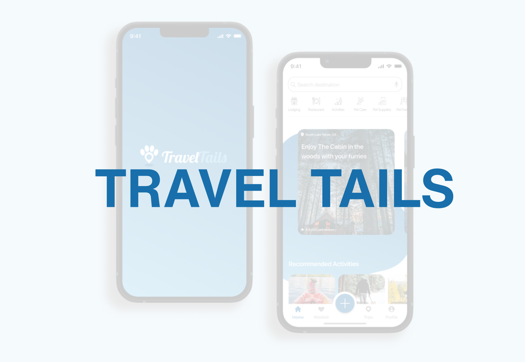
More Projects